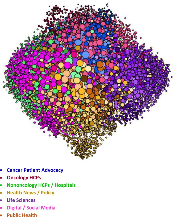
Fig 4. Oncology SNA overview.
Within the visualization, each dot represents a node. Size and position of the nodes are based on follower relationships within the network, and their color is based on attentive clustering. The figure shows the size, positioning, and color of the nodes within the primary audience groups that comprise the Oncology SNA map.

