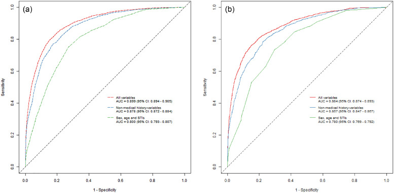
Fig. 1.
Training and validation sample ROC curves. The figures show the training (a) sample and validation sample (b) performance of the three different models based on the best performing algorithm (GLMridge). Each point on the graphs represents a sensitivity and a specificity for a particular cut-off with regards to risk-score calculated by using the parameters generated by fitting the different models.

