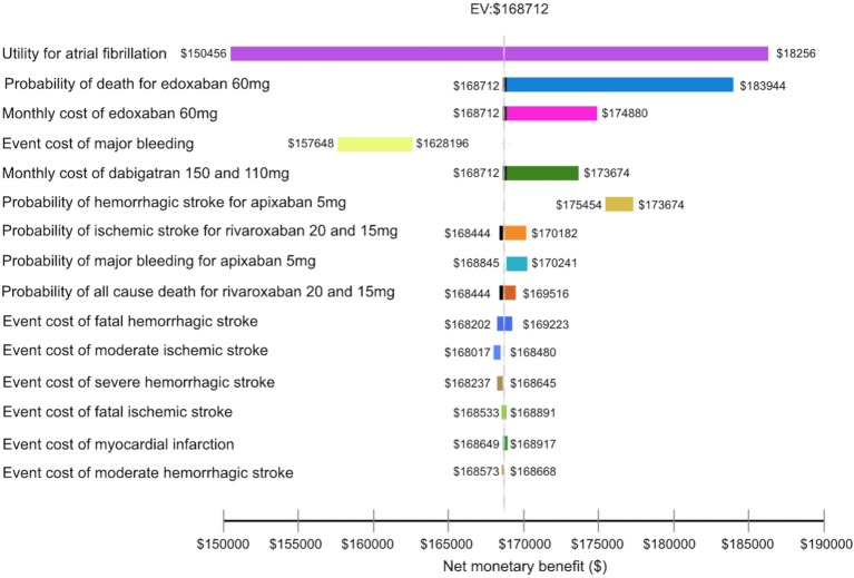
Figure 2.
The tornado diagram depicts the impact of inputs on the net monetary benefit. The vertical black dot line represents an expected cost from the preferred treatment for all input variables being analyzed. Each horizontal bar represents net monetary benefit value expected from a range of the variable we assessed.

