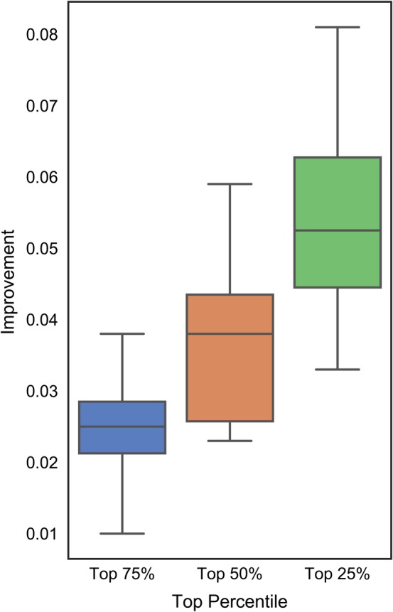
Figure 5.

Improvements in the actual area under the receiver operating characteristic curve (AUC) values computed as the difference between the AUC for subsets of the top 25% (in green), 50% (in orange) and 75% (in blue) of the test proteins selected based on their AUCs values estimated by DISOselect and the data set‐level AUC. Positive values of the improvement indicate that AUC for the subsets of the test proteins are higher than for the complete test data set. The box plots represent the distribution of the improvements across the 12 disorder predictors where whiskers corresponding to the minimal and maximal improvements and boxes denote the first, second and third quartiles
