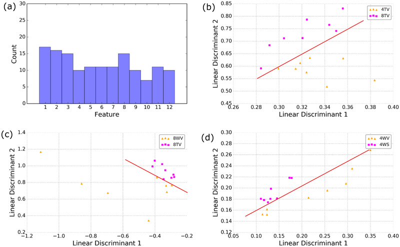
Figure 9.
Histogram of the frequency with which features were selected (a). From the best features, the linear discriminants were computed and the data were projected onto these axes. Examples for which the data can be separated with high accuracy with only 2 linear discriminants for age (b), genotype (c) and treatment (d). Red lines are a visual aid to illustrate the axis of discrimination.

