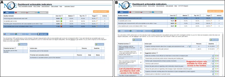
Figure 1.
NICE dashboard displayed an overview of pain management performance (upper part) and four types of pages specific to the selected indicator (lower part). the difference between study groups was only in the action plan page. The feedback-only group received an empty structured action plan (A) and could record and update potential barriers and intended actions. The action plan for the feedback-with-toolbox (B) group was supplemented with a pre-filled list of potential barriers and suggested actions (indicated by the NICE icon). Some actions included supporting materials (indicated by a wrench icon) available for download. Users could add suggested actions to their action plan (plus sign) or hide them if they were not relevant (minus sign).

