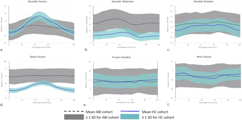
Fig. 1.
Kinematic data for ABI and HC groups. Graphs a-f demonstrate the joint axis movement during one complete gait cycle from ground contact to ground contact for each of the upper limb joint axes. The position of the joint in degrees is represented along the y-axis. The black dashed line represents the mean and the grey shaded portion of the graph represents ±1SD for movement in the ABI cohort for their affected side. The blue solid line represents the mean for the HC cohort and the pale blue shaded area represents ±1SD of the HC cohort

