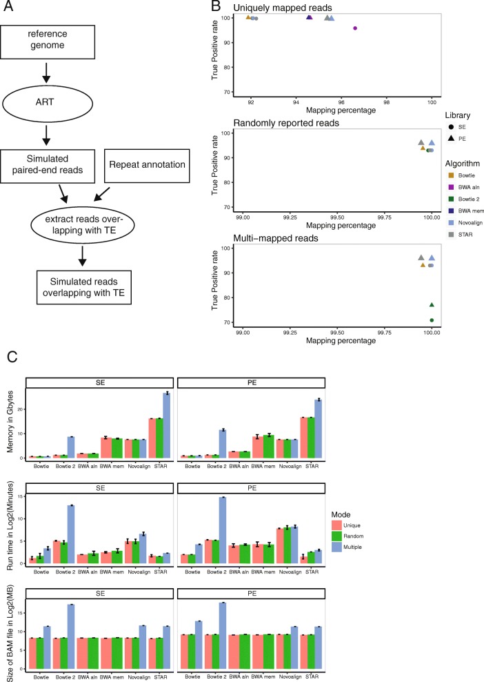
Fig. 1.
Comparison of mapper efficiency with mouse simulated data. a A diagram showing the method for the data simulation. The circles represent used tools and the rectangles correspond to files. b True Positive (TP) rate versus mapping percentage with chromosome 1 of the mouse genome. The dots are the average values of three independent simulated libraries. SE and PE refer to single end and paired end, respectively. c Use memory, run time and size of the BAM file with chromosome 1 of the mouse genome. The error bars correspond to standard deviation from three independent simulated libraries

