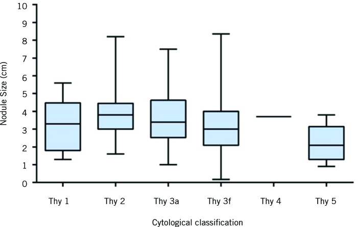
Figure 1.
Box plot of thyroid nodule size distributions according to cytology classification. The solid line within each box represents the median. The box comprises the 25th to 75th percentiles of nodule size in each cytology class. The whiskers represent the most extreme data point (minimum–maximum) for each cytology class.

