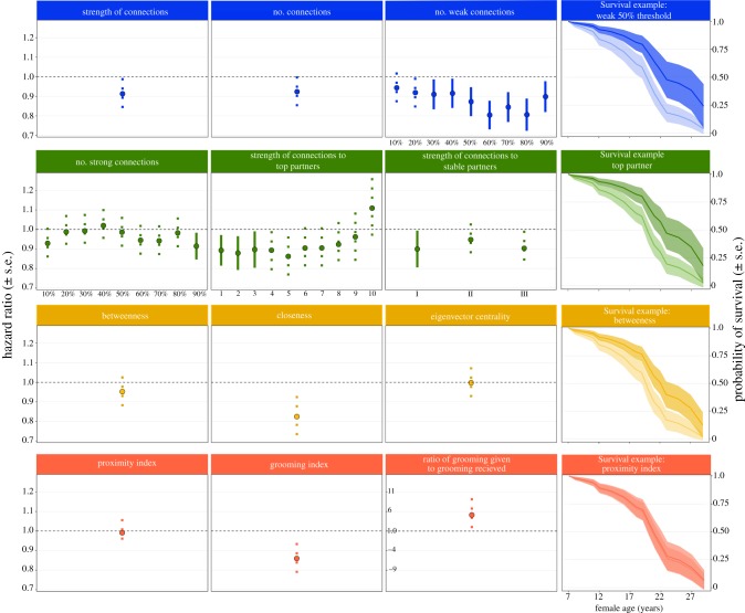
Figure 2.
The relationships between different measures of social connectedness and mortality hazard (hazard ± s.e.) of adult female rhesus macaques. The first three columns (from left) show the mortality hazard under each measure of connectedness used in this study. Hazards of 1 indicate no change in survival in relation to social connectedness, while hazards of less than 1 indicate models where mortality decreases (and the probability of survival increases) as social connectedness increases. Solid error bars indicate measures that significantly predicted survival. Dashed error bars indicate measures did not significantly predict survival. Colours indicate the type of connectedness measure: blue (top row) are social integration, green (second row) are dyadic connectedness, yellow (third row) are structural connectedness and pink (bottom row) are direct connectedness. For ‘strong connections’ and ‘weak connections’, x-axis labels indicate the proportion of connections in the population considered ‘strong’ or ‘weak’. In ‘top partners’, x-axis labels indicate the number of partners considered to be ‘top’. In ‘stable partners’ x-axis labels indicate the definition of stability used: I is any partner, II is top 3 partners and III is a top-50% of all partners. In contrast to the other measures, ratio of grooming given to grooming received does not show the changing mortality hazard as ‘connectedness’ increases, it instead represents a ratio. The y-axis in this plot is expanded to accommodate its divergent scale. ‘Survival examples’ (furthest right column) show an example of the relationship between age and survival probability for one of the measures used under each type of connectedness measure. Curves show the predicted survival probability for individuals with low (lighter colour; 10th quartile of observed values) and high (darker colour; 90th quartile of observed values) connectedness. (Online version in colour.)

