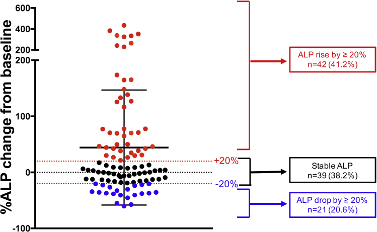
Figure 2.
The percentage change in ALP from baseline to last follow-up. Each dot represents an individual patient (n = 102) and is color coded to show 3 different groups. Red, ALP increase by ≥20%; black, stable ALP (-20% to +20%); blue, ALP drop by ≥20%. The black dotted line at 0 represents no change, with those below having a decrease in ALP at last follow-up and those above having an increase in ALP at last follow-up, as compared with baseline ALP before vedolizumab.

