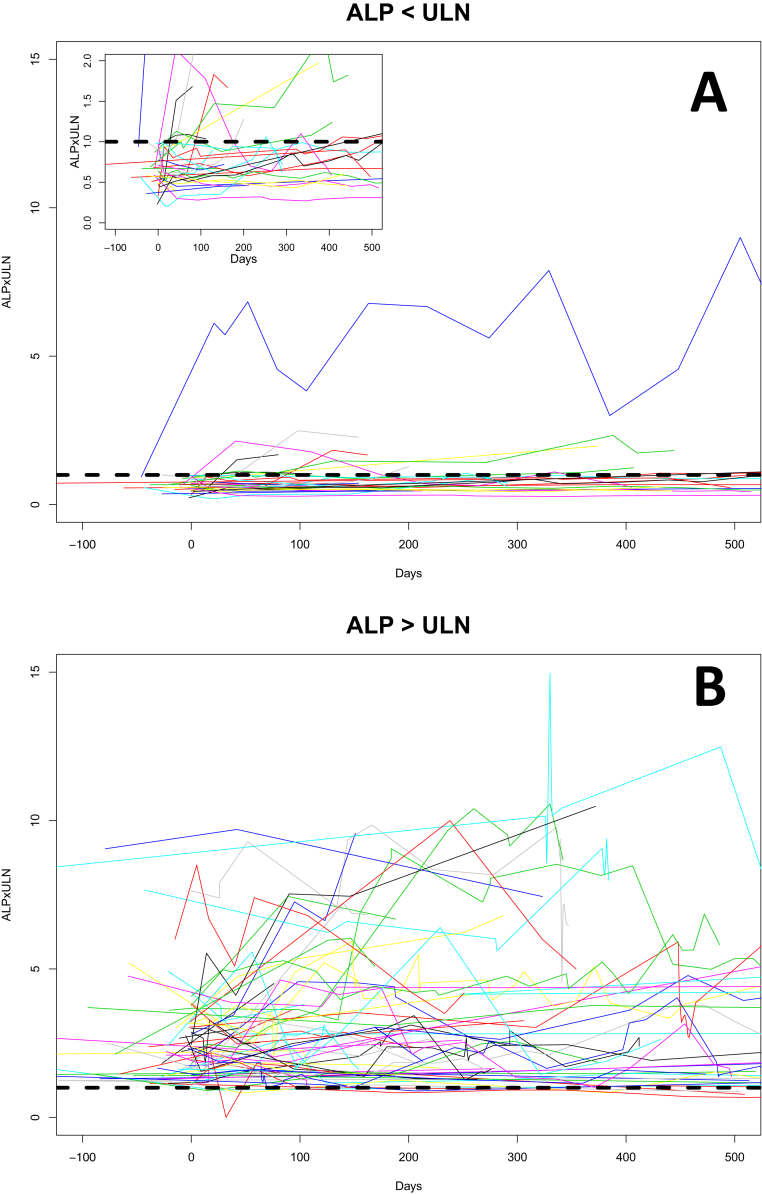
Supplementary Figure 1.
The trajectory of ALP from baseline over time according to baseline ALP below and above ULN (n = 102). These spaghetti plots show ALP at baseline and different time points on vedolizumab. Each line represents a unique patient. The dotted black line represents an ALP of 1 × ULN. (A) Patients whose baseline ALP was less than 1 × ULN. (B) Patients whose baseline ALP was greater than 1 × ULN. The inset in A is a magnified portion of the graph to more easily see the trajectory of those below the ULN. Vedolizumab was started at Day 0. Patients whose baseline ALP was <ULN tended to follow a fairly stable course, whereas those with baseline >ULN followed a fairly erratic course.

