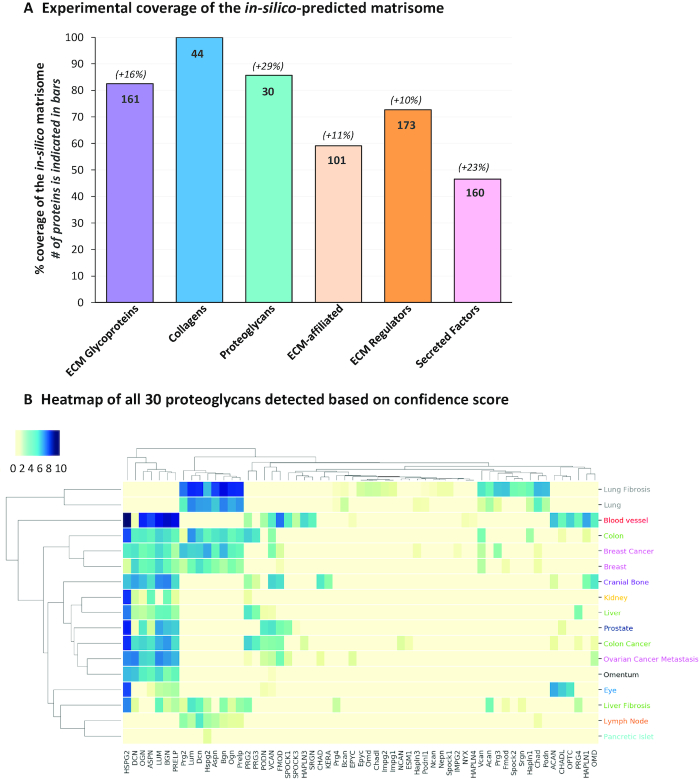
Figure 3.
Building an ECM Atlas. (A) Experimental coverage of the in-silico predicted matrisome. Bar chart represents, for each matrisome category (x axis), the percentage of the in-silico predicted genes encoding proteins detected in the proteomic studies included in MatrisomeDB (y axis). The actual number of proteins detected is indicated inside the bars. The percentages indicated above the bar chart indicate the increase in coverage with the updated database. (B) Hierarchically-clustered tissue distribution heatmap of all 30 proteoglycans detected and reported in MatrisomeDB. The color code indicates the confidence score from high (dark blue) to low (light yellow).

