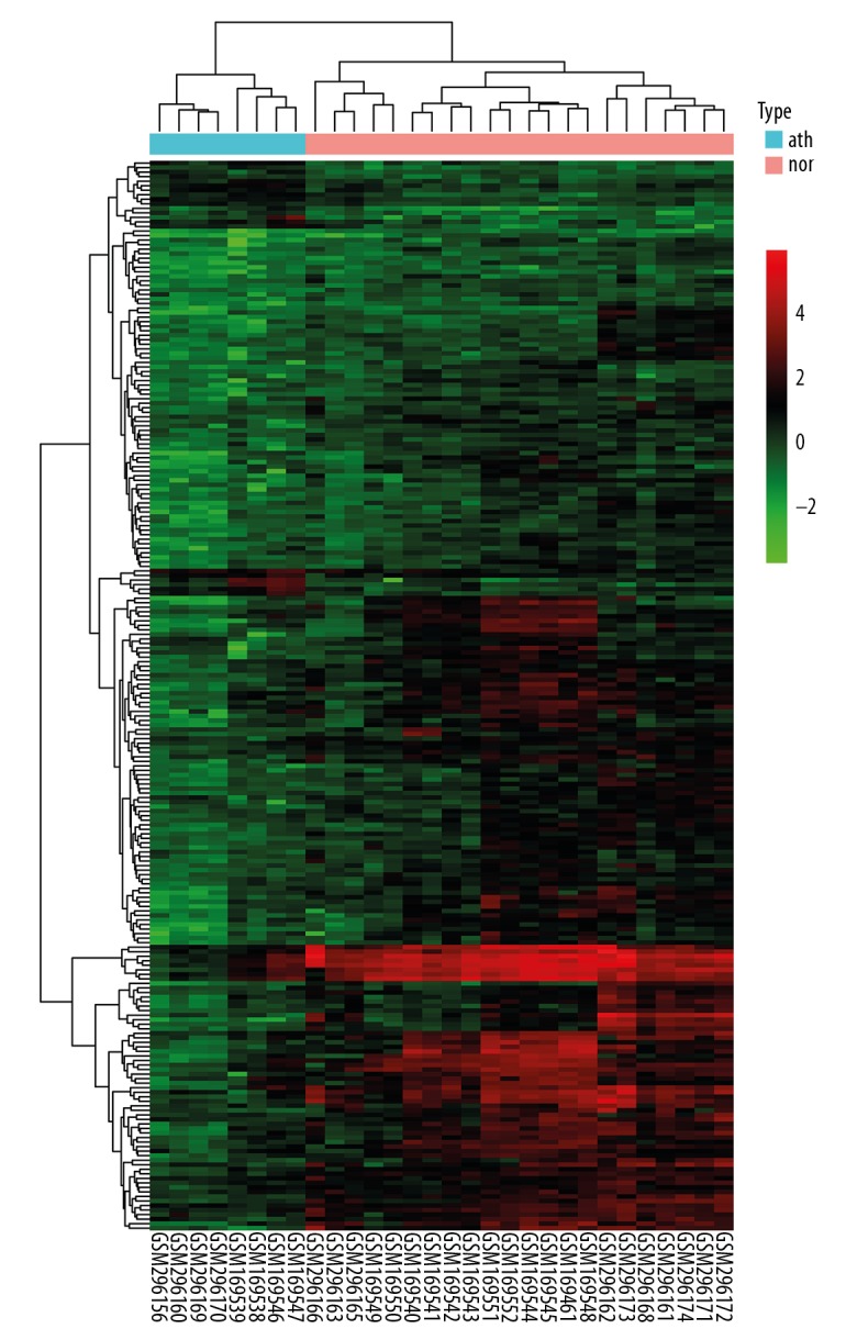
Figure 3.

Hierarchical clustering heatmap of DEGs. The bottom horizontal axis shows the names of samples and the vertical axis shows the clusters of DEGs. Colors towards red represent gene expression value relatively upregulated and colors towards green represent gene expression value relatively downregulated. nor – normal samples; ath – atherosclerotic samples.
