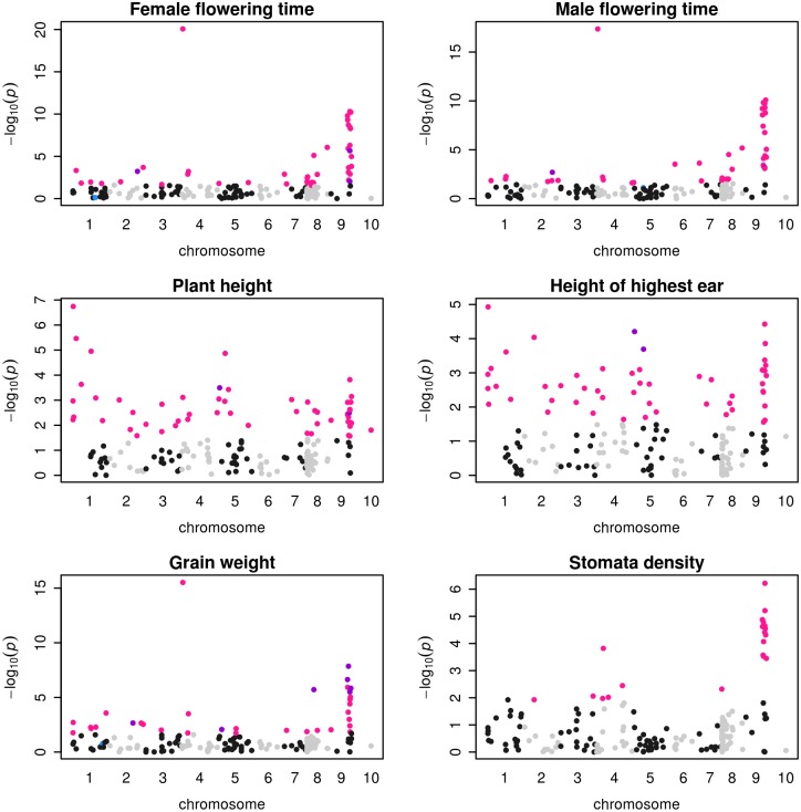
Fig 5. Manhattan plots of associations between 171 outlier SNPs and 6 phenotypic traits.
X-axis indicates the positions of outlier SNPs on chromosomes 1 to 10, black and gray colors alternating per chromosome. Plotted on the Y-axis are the negative Log10-transformed P values obtained for the K = 5 model. Significant associations (10% FDR) are indicated considering either a structure matrix at K = 5 (pink dots), 11 populations (blue dots) or both K = 5 and 11 populations (purple dots) models.

