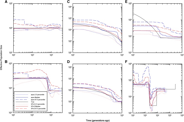
Figure 3.
Comparison of the estimation quality of epos (blue) to results from the Stairway Plot (SP, red) method of Liu and Fu (2015). In each panel, the means of 10 medians and 5 and 95% quantiles are shown (dotted and dashed lines, based on averages of 10 independently derived SFSs). The black lines denote the true underlying demography used to simulate the data.

