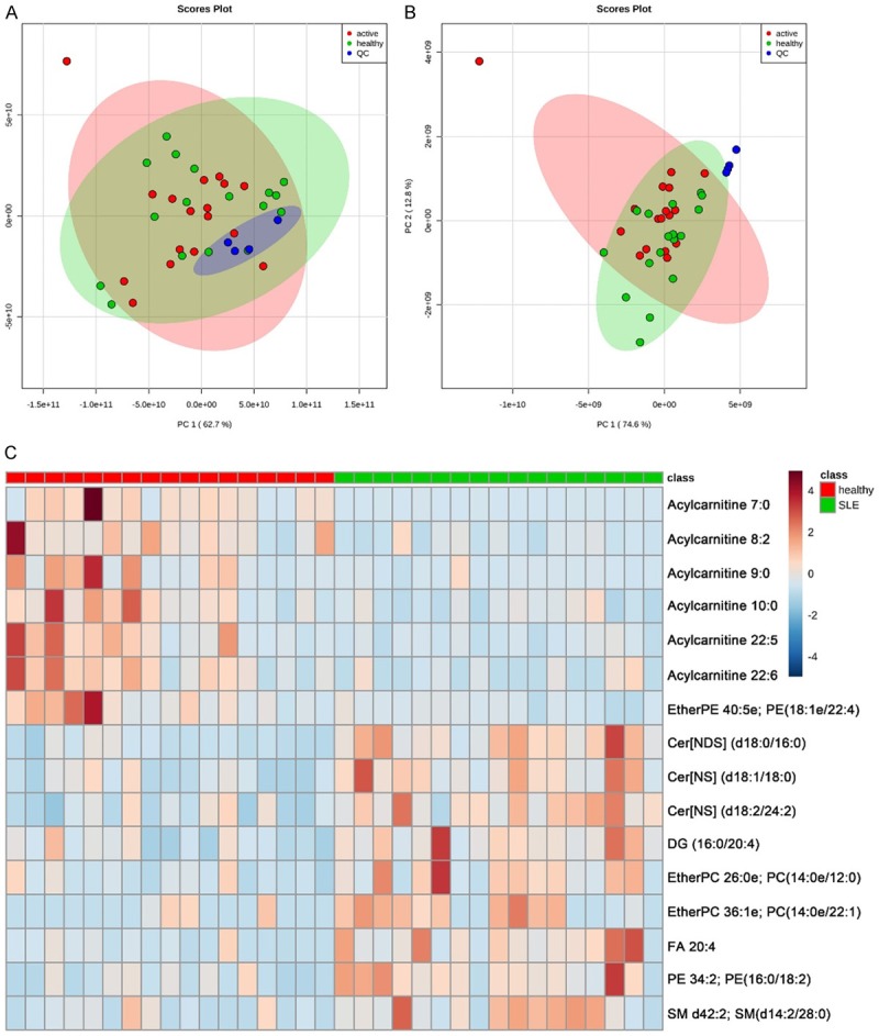
Figure 1.

PCA score plots and heatmap of lipidomics. Overview of PCA score plots from all SLE (red), all healthy (green), and QC (blue) in positive mode (A) and negative mode (B). (C) Heatmap of the 16 significantly altered lipids in positive mode (+) and negative mode (-). The color is positively correlated with the intensity of change in metabolites, with red indicating up-regulation and green indicating down-regulation.
