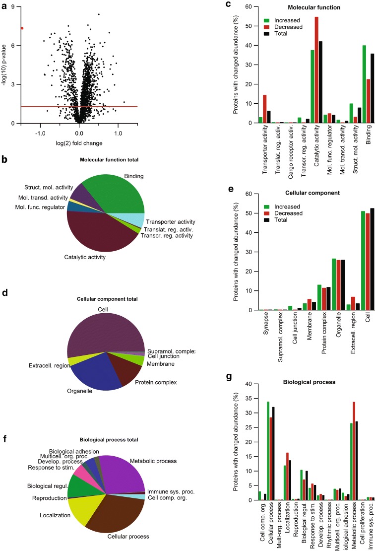
Fig. 1.
Proteomic and bioinformatic profile of the CP from Ncbe wt and Ncbe ko mice. a Volcano plot of the peptide quantification in Ncbe wt and Ncbe ko CP, where the primary axis shows the log2 (mean peptide abundance ratio), while the secondary axis designates the −log10(p value). The horizontal red line represents the Benjamini–Hochberg false discovery rate threshold (p = 0.05). The red dot marks the data point for Ncbe peptides encoded by pre-STOP codons. Pie and bar graphs visualizing the distribution of proteins detected in both groups classified by gene ontology (GO) terms for molecular functions (b, c), cellular components (d, e), and biological processes (f, g). The bar graphs illustrate the percent wise distribution of proteins among GO-terms topics for all detected proteins (black bars), and proteins that are either increased (green bars) or decreased (red bars) in Ncbe ko CP compared to Ncbe wt

