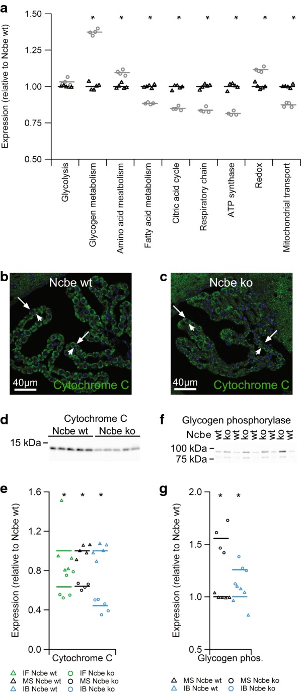
Fig. 3.

Protein abundance of proteins in selected metabolic pathways. a Scatter plot showing the relative changes in abundance between Ncbe wt and Ncbe ko CP among proteins involved in the glycolysis, glycogen, amino acid, and fatty acid metabolism, the tricarboxylic acid (TCA) cycle, respiratory chain, subunits of the ATP synthase, redox enzymes and mitochondrial transport proteins (*p > 0.05, n = 5). Mean values are normalized to control (Ncbe wt) and indicated by horizontal bars. Triangles indicate data point from Ncbe wt CP, whereas circles represent data from Ncbe ko CP. b, c Representative immunofluorescence micrographs comparing the protein expression of cytochrome C (green) in Ncbe wt and Ncbe ko 4th ventricle CP, respectively. Nuclei are stained blue. d Immunoblot analysis of cytochrome C protein abundance in the CP from Ncbe wt and Ncbe ko mice. e Scatter plot comparing relative changes in cytochrome C protein abundance obtained by immunofluorescence microscopy (IF), proteomic mass spectrometry analysis (MS), and immunoblotting (IB) (*p < 0.05, n = 5). Mean values are normalized to control (Ncbe wt) and indicated by horizontal bars. Triangles indicate data points from Ncbe wt CP, whereas circles represent data from Ncbe ko CP. f Immunoblot analysis of glycogen phosphorylase (brain type) protein abundance in the CP from Ncbe wt and Ncbe ko mice. g Scatter plot comparing relative changes in glycogen phosphorylase abundance obtained by proteomic mass spectrometry analysis (MS), and immunoblotting (IB) (*p < 0.05, n = 5). Mean values are normalized to control (Ncbe wt) and indicated by horizontal bars. Triangles indicate data points from Ncbe wt CP, whereas circles represent data from Ncbe ko CP
