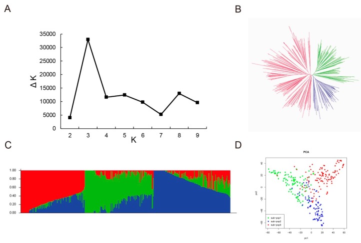
Figure 3.
Population structure analysis of 347 soybean lines. (A) Calculation of the true K value in the association population. (B) A maximum likelihood neighbor-joining tree of the tested 347 lines. (C) Population structure estimated by STRUCTURE. Three colors represent three subpopulations. Each vertical column represents one individual and each colored segment in each column represents the percentage of the individual in the population. (D) PCA plots of the 347 lines.

