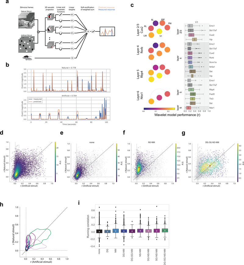
Figure 7: Class labels are validated by model performance.
(a) Schematic for the wavelet models. (b) Example model performance for one neuron for both natural (top) and artificial (bottom) stimuli where r is the Pearson’s correlation coefficient between the measured and predicted values. (c) Pawplot and box plot of model performance, r, for wavelet models trained on natural stimuli. The box shows the quartiles of the data, and the whiskers extend to 1.5 times the interquartile range. Points outside this range are shown as outliers. Only neurons imaged in all three sessions are included (n=15,921, See Extended Data 9 for sample sizes). For other cortical areas, see Supplementary Figure 10. (d) Density plot comparing the r values for model trained and tested on natural stimuli to the r values for model trained and tested on artificial stimuli, n=15,921. R is the Pearson’s correlation coefficient between the measured and predicted values. (e) Same as d. Only neurons in the “none” class are shown in the density (n=5,566), all other neurons are in gray. The red dot marks the median model performance for neurons in this class. (f) Same as e for the “NS-NM” class (n=2,412). (g) Same as e for the “DG-SG-NS-NM” class (n=1,451). (h) Contours for the density of model performance, as in e-g, for all classes (n=15,921). The contours mark the boundaries of each class within which 66% of datapoints lie. Linewidths reflect the number of neurons in each class as provided in Figure 6d. R is the Pearson’s correlation coefficient between the measured and predicted values. (i) Box plot of running correlation for each class.

