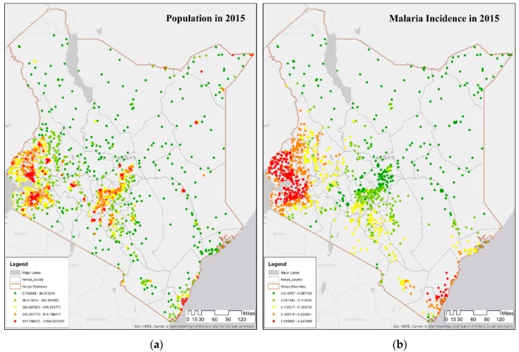
Figure 2.
Demographic and Health Surveys (DHS) datasets. (a) Map showing population distribution of DHS clusters in counties of Kenya in 2015. (b) Map showing average malaria incidence rate per 1000 in DHS clusters in Kenya in 2015. The gray outlines on each map show boundaries of counties in Kenya. On both maps, the transition from red to yellow to green color denotes the change in malaria incidence rate per 1000 from high to low ends of the distribution.

