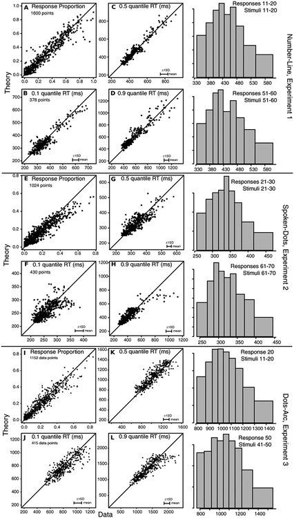
Figure 3.
Model predictions plotted against data for, A, the proportion of responses, B, C, and D, the 0.1, 0.5 (median) and 0.9 quantile RTs respectively for the number-line task, Experiment 1. The points show the values for all the stimulus and response groups (10×10) for data from each individual subject. All 1600 are shown for proportions of responses, but only those conditions with greater than 10 responses are shown for RT quantiles. The horizontal error bars in the bottom right corner represent the mean 1 SDs in the quantile RTs derived from a bootstrap analysis. E, F, G, and H: the same as A, B, C, and D but for Experiment 2 with smaller numbers of points in the plots because of the smaller stimulus range. I, J, K, and L: The same as E, F, G, and H but for Experiment 3. On the right hand side are some group RT distributions formed by averaging quantile RTs across subjects and drawing equal area rectangles between them (Ratcliff & McKoon, 2008, Figure 5; Ratcliff, 1979).

