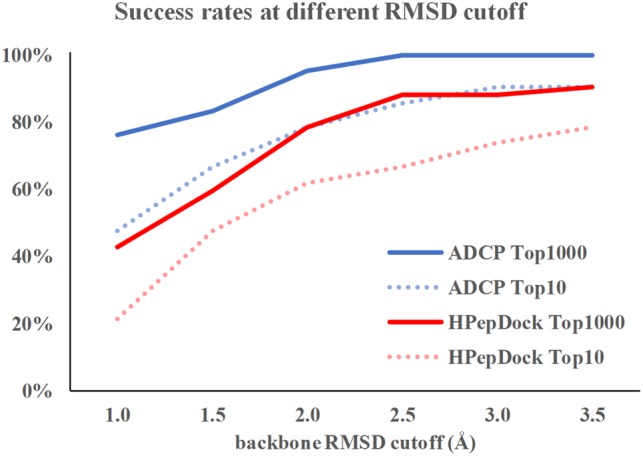
Fig. 3.

The comparison of success rates for ADCP and HPepDock with different success criteria. Blue solid line represents the success rate for ADCP if the top 1000 solutions are considered and blue dashed line represents the success rate if the top 10 solutions are considered. Red solid and dashed lines represent the success rate for HPepDock if the top 1000 solutions and the top 10 solutions are considered, respectively (Color version of this figure is available at Bioinformatics online.)
