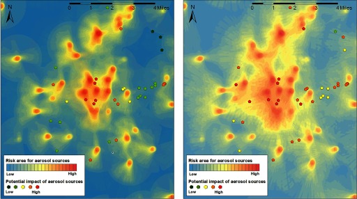
Figure 4.
Heat map with upwind area of Legionnaires’ disease case residences (excluding hospital inpatient stays) during the exposure window and aerosol sources, using a 1-mile (left) or 2-mile (right) upwind search radius. Heat maps were generated with ArcGIS (Esri). The heat map depicts the potential impact of a (virtual) aerosol source could have had on a case residence in the exposure window of each case (the closer to the residence, the higher the potential impact). The pentagonal shapes depict the actual aerosol sources, with the number of cases they could potentially have reached in their individual exposure windows from low () to high ().

