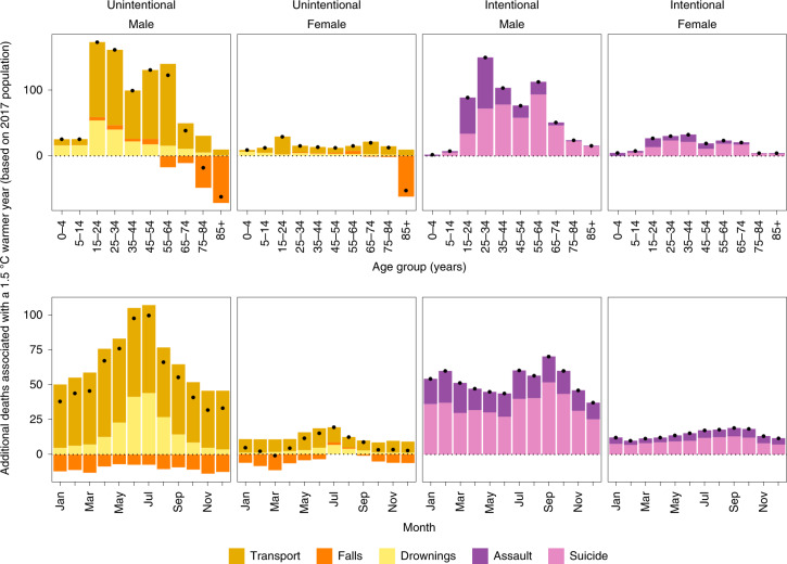
Fig. 3. Additional annual injury deaths for the 2017 US population in the year in which each month was +1.5 °C warmer compared with 1980–2017 average temperatures.
The top row shows the breakdown by type of injury, sex and age group. The bottom row shows the breakdown by type of injury, sex and month. Black dots represent net changes in deaths for each set of bars. See Extended Data Fig. 3 for results of the scenario of 2 °C warmer.

