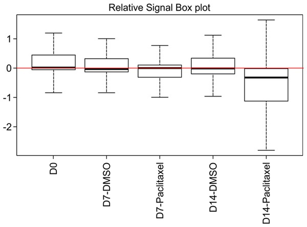
Figure 3.

Boxplot showing the distribution of sgRNA frequencies using high-throughput sequencing. The Y-axis corresponds to the relative log2 counts per million (CPM) for each cell sample at different times. The red line represents the average relative log2, and the box extends from the first to the third quartile, with the whiskers denoting 1.5 times the interquartile range.
