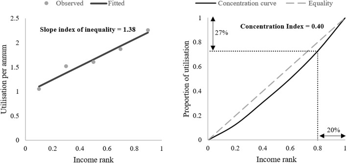
Fig. 1.
Visualizations of inequality metrics. The left panel shows the line fitted through a cloud of data to generate a slope index of inequality estimate (1.38). The right panel shows the concentration curve of health care utilization. In both instances, low income groups use less health care than high income groups. Notes: 1. The interpretation of the slope index is that expected utilisation increases by 1.38 units as we move from the lowest to highest income group. 2. The concentration index is defined as two times the area between the concentration curve and the line of equality. The former becomes more convex as inequality increases, increasing the area and the concentration index

