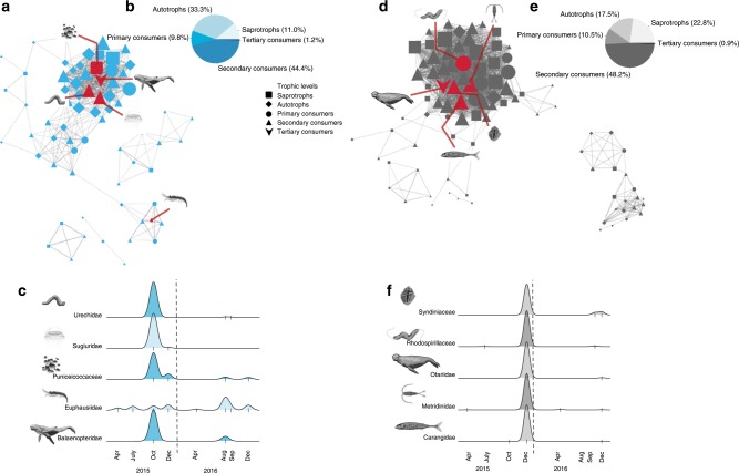
Fig. 2. Network visualisation and amplicon-index abundance of selected taxa over time.
Network visualisation for the autumn 2015 and 2016 (blue) subnetwork (a–c) and the December 2015 (grey) subnetwork (d–f). The blue (a) and grey (d) subnetworks are visualised with nodes (taxa) and edges (correlations) representing the connections between the individual taxa. To best visualise the subnetworks, only taxa with a network connection (edge weight) above a threshold of 0.2 are shown (i.e., low correlations were removed, see Methods for edge calculations). The different trophic levels detected within the subnetworks are represented by different symbols, see legend. These panels illustrate the complexity of the co-occurring taxa in the blue and grey subnetworks, upon which the taxa representations of panels (c) and (f) are chosen. The distribution of the trophic levels within each subnetwork is represented in (b) and (e). The size of the taxon node symbol is relative to the number of edge connections that an individual taxon has within the subnetwork and the width of the edges represents the weight of the correlation between two given nodes. The red lines within each subnetwork point to highly correlated taxa (r > 0.9) or highly connected taxa (within the top 10%) within the subnetworks, highlighted in (c) and (f). The scaled abundances of these taxa are presented in (c) and (f) during the course of our sampling period. The tick marks in the x-axis of plots (c) and (f) represent the times of sampling when we have observations of these taxa, the height of the y-axis is relative to the number of observations per taxon and does not represent absolute abundance values or biomass. The vertical dashed lines represent January 1, 2016.

