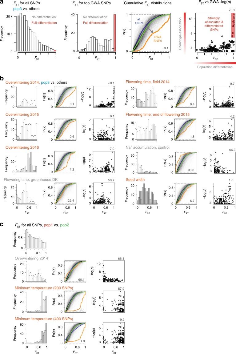
Fig. 6. Distribution of FST values for top GWA hits.
a Reading guide for panels b and c. The leftmost panel shows the distribution of FST values for all SNPs. The SNPs shaded in gray are not differentiated between the two subpopulations compared, i.e. their genotype cannot be explained by population structure. The converse is true for the SNPs shaded in red; their genotypes can be fully explained by population structure. The second panel from the left shows distributions of FST values for the 200 SNPs with highest -log(p) GWA scores for the trait indicated. The third panel from the left shows experimental cumulative distribution graphs for the FST values for all SNPs (blue) and the SNPs shown in the panel to the left (orange). If the orange curve lies below the blue curve, it indicates a shift to higher FST values for the SNPs with high GWA scores. Each of the semi-transparent black lines indicate FST distributions for the top 200 SNPs from a GWA analysis of permuted phenotype data. The green line indicates the distribution for all 1000 sets of permuted data. The false discovery rate shown in the lower right hand corner indicates the frequency (%) of permuted distributions shifted to higher FST values than the observed data. The rightmost panel shows FST values plotted versus GWA -log(p) scores. The false discovery rate shown in the upper right hand corner indicates the frequency (%) of FST versus GWA -log(p) Spearman correlation coefficients with larger values than the correlation coefficient of the observed data. a, b FST values were calculated based on a pop3 vs. non-pop3 comparison. c FST values were calculated based on a pop1 vs. pop2 comparison. Traits likely associated with local adaptation are highlighted (orange). All analyses were carried out using top 200 GWA SNPs, except for the lower panel in c where the top 400 SNPs were used. Source data are provided as a Source Data file.

