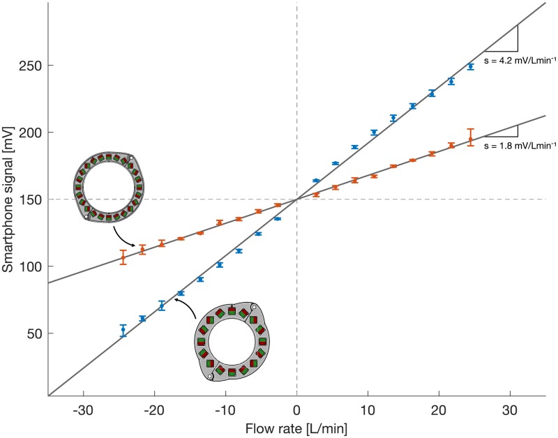
Fig 11. Results of flow benchmark measurements.
Results for P16LM are shown in blue, those of P24SM are shown in red. The median signal amplitudes are plotted as dots, and the minimum and maximum measurement values are indicated with error bars to visualize repeatability. The lines depict the best linear fit through the measurement data.

