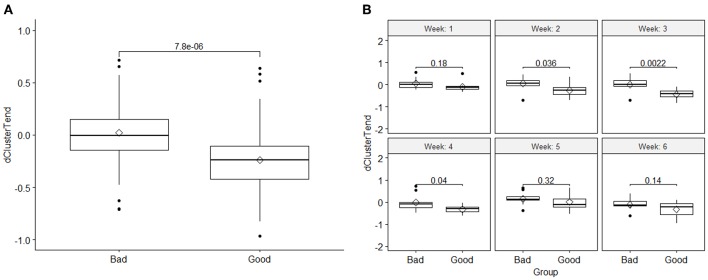
Figure 3.
(A) Comparison of the DRF (cluster tendency) values between the two response groups and the t-test p-value, and (B) a t-test comparison of weekly DRFs between the good and bad response groups for the DRF (cluster tendency). The boxplots show the median and interquartile range for each response group and the diamond data point in the middle represents the mean of the group.

