
Figure EV3. Centromeric and kinetochore proteins show a similar abundance profile (related to Fig 4).
-
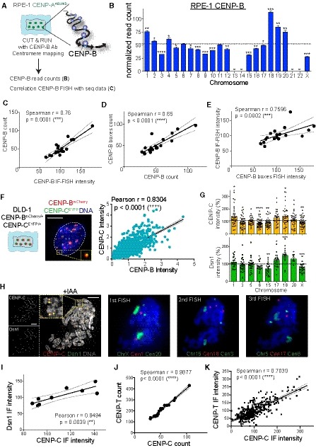
ASchematic of the experimental procedure used in (B) and (C), Ab: Antibody.
-
BBarplot showing the sum of the normalized reads count of different HOR arrays (see Table EV2) representing CENP‐B binding following CUT&RUN, sequencing and centromere mapping. The dashed line represents the mean and error bars represent the SEM of three independent experiments. Acrocentric chromosomes 13, 14, 21, and 22 are missing and marked by a line. Bars are labeled with asterisks according to the significance of their difference from the mean (t‐test). *P < 0.05; **P < 0.01; ***P < 0.001; ****P < 0.0001.
-
C–EScatter plot showing significant positive correlation between the mean of (C) CENP‐B count (n = 3) and CENP‐B IF‐FISH intensity (n > 37), (D) CENP‐B count and CENP‐B boxes count (n = 4) and (E) CENP‐B IF‐FISH and CENP‐B boxes FISH intensity (n > 50 cells; r = Spearman rank coefficient). The lines represent linear regression with 95% confidence interval. In (D) data from chr 1, 5 and 19 were excluded from the analysis as chr 13, 14, 21 and 22 to better assess correlation without the FISH correction (as in Fig EV2I).
-
F(Left) Schematic and representative image of CENP‐BmCherry and CENP‐CEYFP cell and linear regression of signal quantification. Inset shows CENP‐BmCherry and CENP‐CEYFP signal colocalization. (Right) Scatter plot showing a significant positive correlation between centromere CENP‐C and CENP‐B intensity (r = Pearson rank coefficient). Scale bar represents 5 μm. N = 66. The lines represent linear regression with 95% confidence interval.
-
GBar graphs show CENP‐C and Dsn1 intensity quantification at the indicated chromosomes normalized over the mean on each metaphase spread. Error bars represent the SEM of three independent experiments and dashed line represents the mean of all the analyzed chromosomes. Each dot represents a cell. *P < 0.05; **P < 0.01; ***P < 0.001; ****P < 0.0001.
-
HRepresentative images of an immunofluorescence on CENP‐C and Dsn1 on metaphase‐arrested chromosome followed by sequential centromere or chromosome‐specific FISH probes staining. Cells were treated for 6 h with IAA to deplete CENP‐A. Scale bar represents 5 μm.
-
I–KScatter plot showing a significant positive correlation between the mean of (I) CENP‐C (n > 3) and Dsn1 (n > 3) intensity, CENP‐C (n = 3) and CENP‐T (n = 2) reads amount (J) and fluorescence intensity (K). r = Pearson or Spearman rank coefficient. The lines represent linear regression with 95% confidence interval.