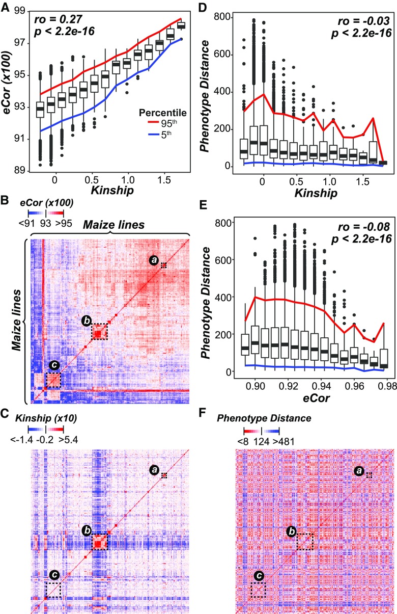
Figure 1.
Relationships between Lines from Transcript and Genetic Marker Data.
(A) Relationship between kinship based on genetic marker data (x axis) and eCor (in PCC) based on transcript data (y axis). Boxplots show the median y axis value for each x axis bin (bin size = 0.15), with the 5th (blue) and 95th (red) percentile ranges shown. The correlation between kinship and eCor was calculated using Spearman’s rank coefficient (ρ).
(B) and (C) The relationships between lines based on eCor (B) or kinship (C) for all pairs of maize lines. Lines are sorted based on hierarchical clustering results using the eCor values. The blue, white, and red color scales indicate negative, no, and positive correlations, respectively. Dotted rectangles indicate clusters of lines discussed in the text.
(D) and (E) The relationships between the Euclidean distance calculated with phenotype values (phenotype distance; y axis) and kinship (D) and eCor (E). Colored lines follow those in (A).
(F) The relationships between lines based on phenotype distance, where the lines were sorted as in (B). Red indicates smaller distance (more similar) and blue indicates greater distances (less similar).

