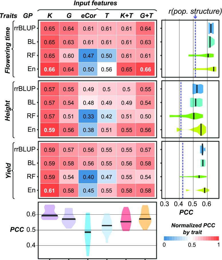
Figure 2.
Genomic Prediction Model Performance.
PCCs between predicted and true values for three traits and four algorithms using six different input features are shown. The text in each box represents the absolute PCC, with the best performing model for each trait in white. The box color represents the PCC normalized by trait, where the brightest red (1) corresponds to the algorithm/input feature combination that performed the best for the trait and the brightest blue (0) corresponds to the combination that performed the worst. Violin plots at right show the PCC distributions among different input features for each algorithm. The median PCCs are indicated with black bars. The model performance PCCs based on only population structure (first 75 principal components) are indicated with blue dashed lines. Violin plots at bottom show the PCC distributions among different algorithms for each input feature.

