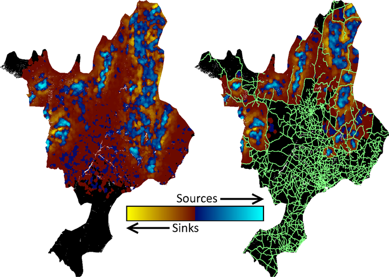
Figure 5.
The observed source-sink distribution resulting from two simulations: ID 7 (no impacts, left) and ID 8 (this study’s maximum impacts, right). Each map was assembled using data from all ten replicates. Demographic sinks trend in color from yellow (strong) to red (weak), while sources trend from blue (weak) to cyan (strong). Neutral areas are showed in black, and the road network is displayed in green.

