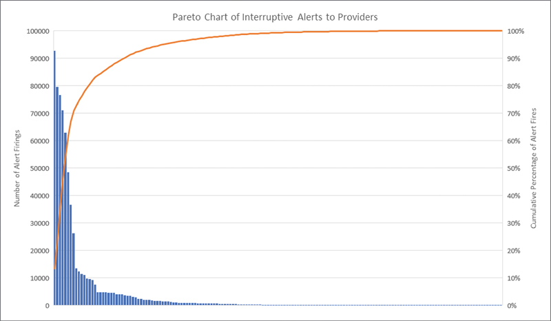
Fig. 5.

Pareto Chart. This chart, created using cumulative alert information from the 16 months preceding our QI project as seen in Fig. 2 , shows the individual number of firings for each interruptive alert as well as the cumulative total sorted from highest volume to lowest volume alerts. QI, quality improvement.
