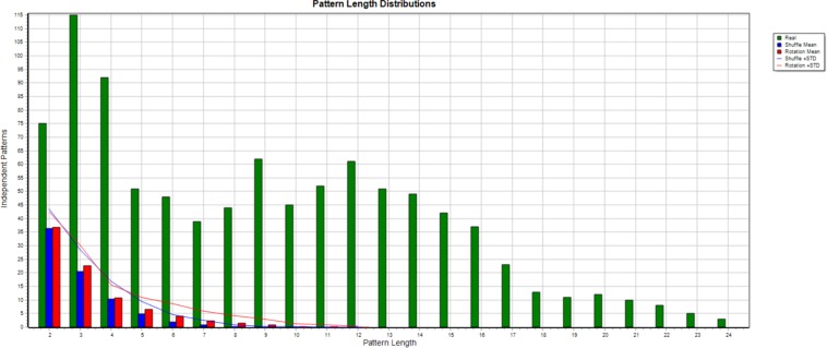
FIGURE 2.
This figure shows the result of a Monte Carlo (50 randomizations) comparison. The number of different T-patterns of each length detected in the initial data is shown in green, while the averages for shuffling and rotation are shown in blue and red, and the blue and red lines add one standard deviation to each.

