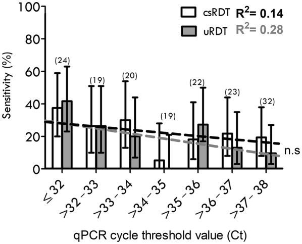
Fig. 2.

Diagnostic performance stratified by qPCR Ct values. The bar chart shows the sensitivity of each test: uRDT (grey) and csRDT (white bar and black trendline) stratified by qPCR cycle-threshold (Ct) values. The number of qPCR- positive samples in each Ct category is given in brackets (n). Trendlines (dashed) are derived from the rolling mean sensitivity calculated for every 10 observations. R squared coefficient values are displayed (uRDT; grey text, csRDT; black text) and difference between R2 values is non-significant (n.s, p = 0.3 one-tailed t-test). (28) Error bars represent upper and lower 95% CI
