Figure 5.
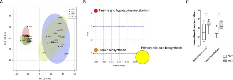
(A) Score plot for PCoA model with PC1 plotted against PC2 with 95% confidence ellipses around the experimental groups (KO DSS-, KO DSS+, WT DSS- and WT DSS+). (B) Metabolic pathway analysis. The metabolic pathways are represented as circles according to their p values from enrichment analysis (Y-axis) and pathway impact values (X-axis) using MetaboAnalyst 4.0. Darker circle colors indicate more significant changes of metabolites in the corresponding pathway (p values). The size of the circle corresponds to the pathway impact score and is correlated with the centrality of the involved metabolites. (C) Boxplots of the abundances of important bile acids significantly differed among the groups. The center line of each box represents the median, and the top and bottom of the box represent the 75th and 25th percentiles of the data, respectively. The top and bottom of the error bars represent the 95th and 5th percentiles of the data, respectively. n = 8 mice per group.

