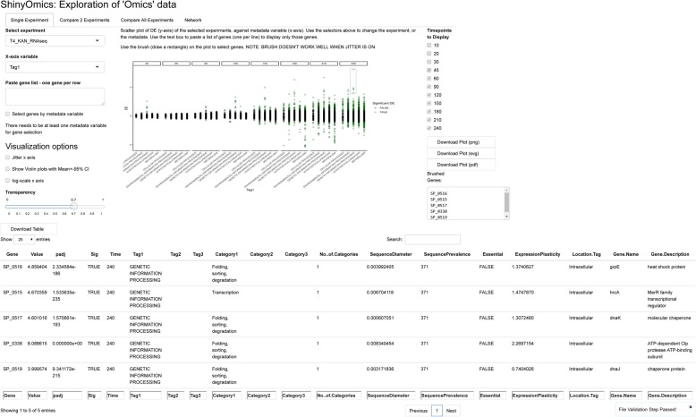
Fig. 1.
Single Experiment panel of ShinyOmics. The tabs above allow the user to navigate to different panels. On the left, there is an experiment selector (where options are populated from the experiment sheet supplied by the user), a gene list selector (when empty, all genes are displayed), a variable selector, and several visualization customization options. Here, the T4 kanamycin (“T4_KAN”) experiment is displayed as a scatterplot. Setting the x-axis variable to “Tag1” splits genes by functional Tag. 4 genes are brushed at timepoint 240 (blue rectangle), whose identity and metadata are displayed in the table (bottom)

