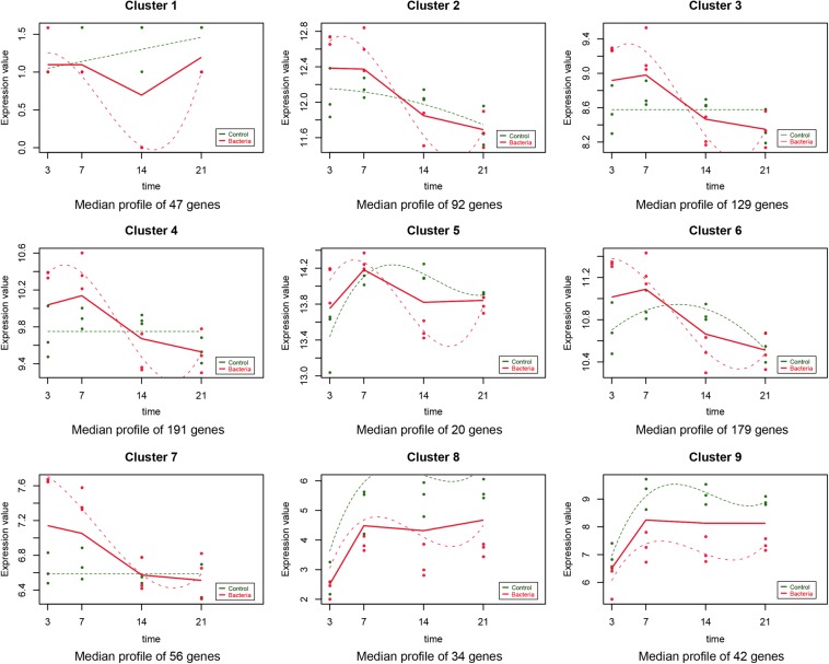
FIGURE 1.
Data visualization according to the cluster analysis. Each plot shows the average expression profile of the gene clusters from all samples. Dots show the actual average expression values for each sample (green and red dots represent the control and F. nucleatum groups, respectively). Fitted curves of the control and F. nucleatum groups are displayed as green and red dotted lines, respectively. The solid line (red) has been drawn to show the actual average value of the gene expression at each time point for F. nucleatum-stimulated group.

