
Figure 2.
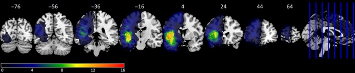
Frequency distribution of tumour (all 45 patients). The colour scale shows minimal overlap (dark blue) to maximal overlap (red). MNI y coordinates of the coronal sections are given. [Colour figure can be viewed at http://www.wileyonlinelibrary.com]