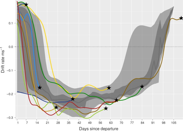
Figure 8.

Drift rates of non‐survivors (colors correspond to individuals), with times of death (and corresponding drift rates) indicated by black stars. The large light gray band represents the 2.5%–97.5% quantiles of the survival dataset, the nested dark gray band the 25%–75% quantiles, and the dark gray line the daily median
