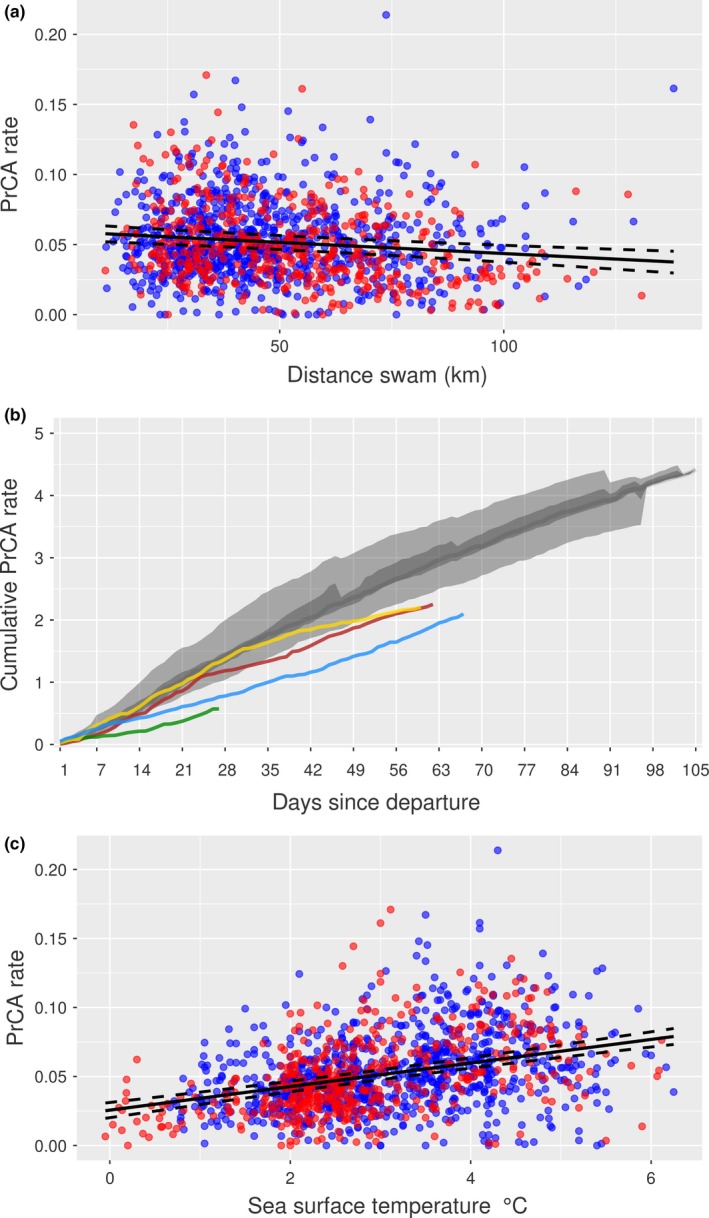
Figure 10.

From top to bottom: (a) daily mean PrCA rates against total distances swam, (b) cumulative daily mean prey catch attempts (PrCA), and (c) daily mean PrCA rates against daily mean sea surface temperatures. In subplots (a) and (c), non‐survivors are red and survivors blue. The line of best fit from linear mixed‐effects models (with random intercept of individual ID; nlme package in R—Pinheiro & Bates, 2014) is in black, and dashed lines are 95% confidence intervals. In subplot (b), colored lines are pups 140076 (yellow), 140061 (red), 140078 (blue), and 140074 (green). The large light gray band represents the 2.5%–97.5% quantiles of the survival dataset, the nested dark gray band the 25%–75% quantiles, and the dark gray line the daily median
