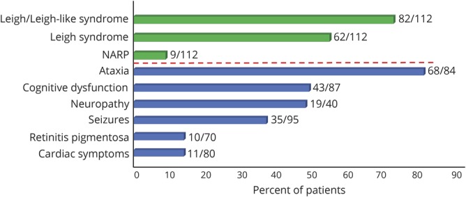
Figure 3. Distribution and frequency of phenotypes and symptoms in our cohort.

Bars indicate the percentage of patients with a given phenotype (green bars) or symptom (blue bars) of the total assessed for this phenotype or symptom.

Bars indicate the percentage of patients with a given phenotype (green bars) or symptom (blue bars) of the total assessed for this phenotype or symptom.