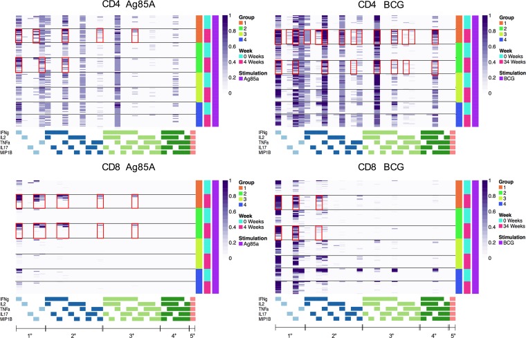
Figure 7. COMPASS heatmaps showing different polyfunctional CD4+ and CD8+ T cell subsets after BCG vaccination.
Stacked COMPASS heatmaps displaying CD4+ (upper panel) and CD8+ (lower panel) whole blood T cell responses to Ag85A (left panel) and BCG (right panel) in BCG revaccinees (Group 1 [IGRA+, orange] and Group 2 [IGRA–, bright green]) versus unvaccinated controls (Group 3 [IGRA+, light green] and Group 4 [IGRA–,blue]). In the heatmap, columns correspond to the different disjoint cell subsets in which responses were detected and are color-coded in the x-axis legend by the cytokines they express (white, “off”; shaded, “on”; grouped by color, “degree of functionality”) and are displayed in order of increasing functionality from left to right (sky blue to peach). For example, the first column represents CD4+ T cells that produce IFN-γ but none of the other functions. Rows represent study subjects (Group 1, n = 21; Group 2, n = 20; Group 3, n = 18; Group 4 n = 18), which are ordered by the group they belong to and the time point (0 [turquoise] and 4 [pink] weeks for Ag85A and 0 [turquoise] and 34 [pink] weeks for BCG) as shown in the legend at the right. Each cell of the heatmap shows the probability estimated by COMPASS that the observed response is antigen specific in the corresponding subject (row) and cell subset (column), where the probability is color-coded from white (probability, 0) to purple (probability, 1). A probability of 0 indicates certainty that the observed response is background, while a probability of 1 indicates certainty that the observed response is antigen specific. Horizontal lines were added to separate the time points, and red boxes were inserted to highlight the subsets of interest.

