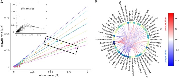
FIG 3.
Codependencies of growth rates. (A) Relationship between abundance and growth rate for samples. The large scatter plot shows growth rates and abundances for the first 10 samples. Each circle denotes one genus in one sample and its sample provenance is indicated by the color. Dashed lines denote the linear relationship between growth rates and abundances predicted by equation 2 for each sample. The black box demonstrates how different slopes (i.e., as community evenness declines, so does the within-sample slope) can result in negative correlation between abundance and growth rate across the samples. The smaller inset scatter plot shows data from all samples (Pearson rho = 0.69, n = 39,815). (B) Growth rate interactions between genera as estimated by genus knockouts. Only interactions that induce a mean growth rate change of 0.1 for all samples (i.e., ubiquitous interactions) are shown. The color of the edges indicates change of growth rate and type of interaction. Red edges denote competition where removal of one genus increases the growth rate of the other, and blue edges denote cooperation or syntropy where the removal of one genus lowers the growth rate of the other. The nodes are colored by the degree (number of total connections) from lime (few) to dark blue (many).

