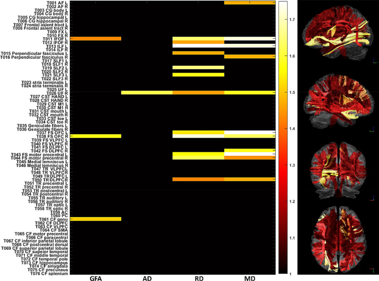
Fig. 6.
The statistic plots show the white matter tracts whose effect sizes of the z-scores were within top 5%. The color spectrum encodes the effect size of the z-score. The horizontal and vertical axes indicate the diffusion indices and tracts, respectively. The right column demonstrates the visualization of tract bundles encoded with the effect size of the z-scores. The brighter color indicates the higher magnitude of the effect size.

