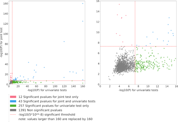
Figure 5.
Quadrant plots derived from example 2. The quadrant plot shows the best signal per region from the multivariate test (y-axis) as a function of the best signal for the same region from the univariate analysis (x-axis). We focused on the sumZ test using weights defined as the loadings of the first PC of the genetic correlation matrix times the inverse of the covariance matrix. Green dots represent regions identified by the univariate test only, red dots represent regions identified by the multivariate test only and blue dots are regions identified by both approaches. Left panel includes all regions [note that −log10(P-value) >160 has been replaced by 160]. Right panel is a zoom centered around the genome-wide significance level (P = 5 × 10⁻⁸).

